Our animation injected creativity into the pharmaceutical industry
Project Goal
Each new animation project we take on is a welcome challenge for us. Every project can be related to a jigsaw puzzle with the starting piece being the question “How do we discuss this?”. This is when all the team members start to circulate, with suggestions and concepts spinning like a carousel. This part of the project includes the fear of the unknown, but with lots of excitement to go with it!
When first assessing how to approach the Polpharma animation, the challenge presented to us did not seem too difficult. It then dawned on us that we not only had to convey information about the campaign itself but had to encourage pharmacists to change their working habits. To add to this, we also had to make sure that the entire animation had the potential to create social media content. This is when the gravity of the challenge really hit home!
Our Approach
In such cases such as this, we adopt an approach of “if it’s not broken, don’t fix it” and replicate the way we approached similar challenges in the past. Our animation had to be lightweight, straightforward, and rhythmic. The sentences within the dialogue had to be sufficient to provide the detail around Polpharma, whilst also leaving adequate space and being manageable for those watching.
From the outset, we chose a female voice-over, which sounded more credible and knowledgeable in relation to the subject matter. We managed to create a text with evenly separated sentences, which gave a neat and tidy feeling to the animation and made it easy to follow.
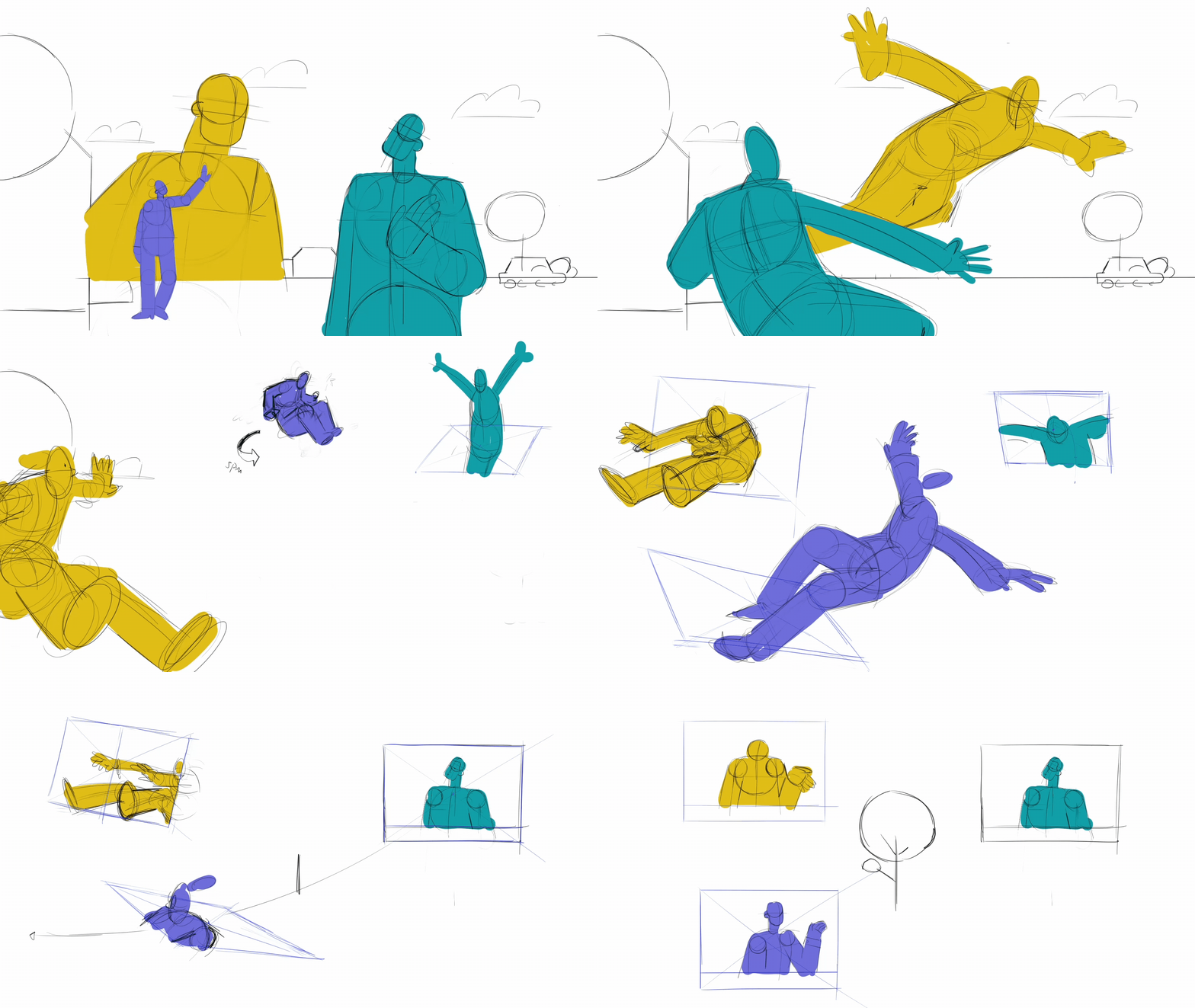
The approach which we chose for the dialogue and text had a significant effect on how we started to think about the visuals of this animation. We knew that we could experiment with the style and design of the animation to effectively compliment the dialogue and audio.
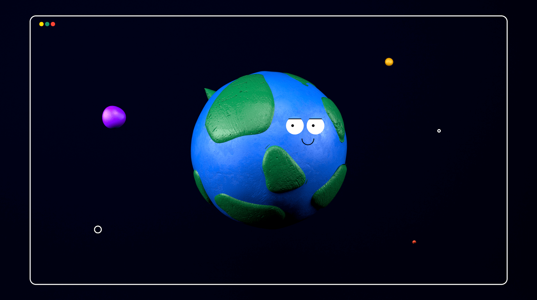
We wanted to create a feeling of warmth for the viewer, not creating tension or stress with negative information. We had high hopes for our animation to be a shot in the arm of positive emotion for the viewer, helping to inspire initiative. We combined stylised 3D graphics, raster graphics, stop motion and flat design. These techniques combined with stop motion provided the animation with an articulate and handmade feeling.
Showreel 2024
Prodigy – game teaser
Universal Export
Food Fight – Mobile Game Trailer
An animated music video for influencers’ smash hit
GQueues tool
Combining Powerful Visuals with Concise Information
The message against ageism reached millions
MetaBrite
Broker Online – Internaxx
First Home
Our Warming Winter Animation was a Christmas Sell Out
U.S. Embassy Warsaw
LittleFund
